Logo Design
I think of logo designers the same way I think of musicians: as wizards whose powers are beyond my mortal ken.
However, I also struggle to give up total ownership of the design process. As such, it took me entirely too long to admit that I had neither the background nor the patience to produce the Firetaker logo.
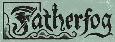
I used the Fatherfog logo as my initial inspiration because it’s clever and scalable. It tells you exactly what kind of game it’s going to be from appearance alone.
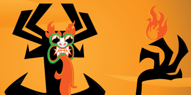
And even though I haven’t watched it since I was a kid, I still often think about the distinctive, high-contrast art style of Samurai Jack. I aimed to create a logo that simultaneously resembled Aku’s hand reaching for a ball of fire while also reading clearly as an ‘F.’
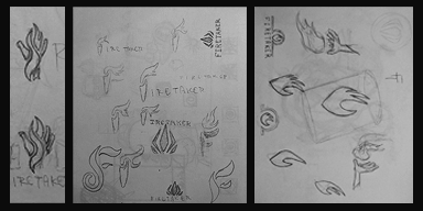
It was a bit of an overengineered mess. However, I realized the clawed hand itself could look like flames. I dropped the ‘F’ prerequisite and decided to focus on a logomark instead of a logotype. Recent Assassin’s Creed titles lock their respective logos in place by enclosing them within the series’ unmistakable emblem. Zeus seeks to snuff out the lives of the foolish mortals who defied him, so I thought using an Omega symbol would be appropriate.

And then, after all that, I realized I wanted to focus on the writing, art, and layout and not a damn logo. So that’s when I reached out to my fellow game designers on the Lionhearth Exploration Outfitters Discord server and enlisted the help of someone who actually likes making logos. Thanks, Akumata, for helping me establish Firetaker’s visual identity. I would not/could not have done it without you.