Illustration Process: Cover Design
Here’s a quick side-by-side comparison for today:
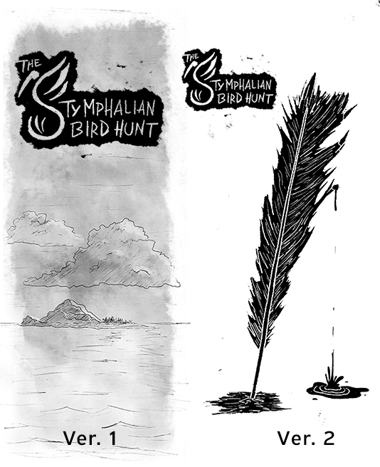
The tone is all off in my original cover. I was going for foreboding, but I think the watercolors made it seem too soft. I wanted dread, not whimsy.
The island illustration also didn’t sell the hook well, either. Yes, the scenario takes place on an island, but a GM is going to pick up this pamphlet if they want to harass their players with a big, man-eating bird that shoots metal feathers. Actually, that was enticing imagery. I swapped the soft tones for stark black-and-white, the island vibes for a feather dripping blood. It fits.
This post is licensed under CC BY 4.0 by the author.